
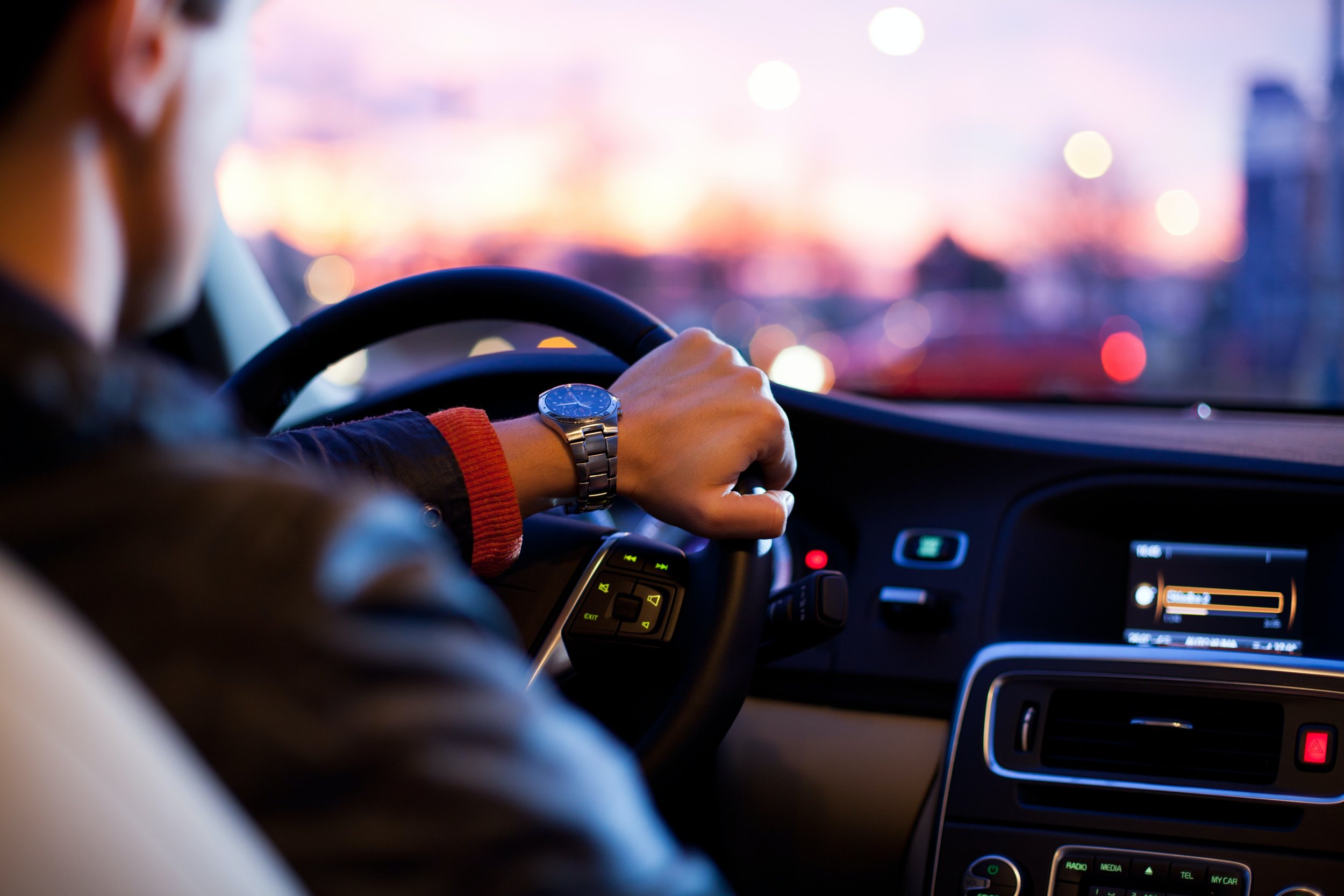
Park Easily, Park Quickly.
To allow drivers to find the closest and cheapest parking spot safely and efficiently when driving.


ParkHere allows drivers to find the closest and cheapest parking spot safely and efficiently when driving.
Competitor Analysis

Customer Persona


Information Architecture Diagram


Stylescapes


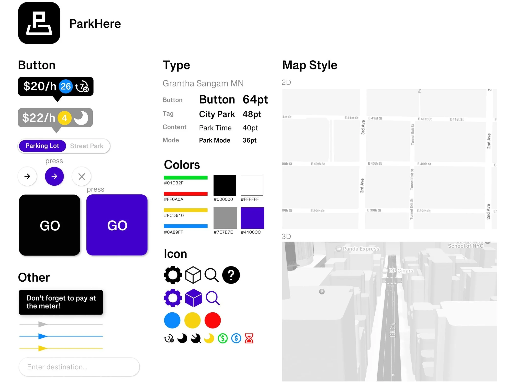
Design Style Guide

Synthesize Learnings
Interviewees

Statistics Capture

Quote Capture

UI Learning
Keep it simple to view
Turn the dropdown menu into a slide bar to let users see two modes at the same time.
Put the info section on the left side since drivers are driving on the left side.
Add arrows on the color lines in street parking mode to indicate the driving direction (avoid one way).
Add more icons instead of words for drivers easy to view and understand.
It’s distracting of having color lines underlay the top menu bar so adding a transparent gradient bar under the menu is easier to see the menu clearly.
Keep as few initiative interactions as possible
Cut off the Payment Info step and go directly to the last Pay step.
Reduce the unnecessary parking information in the last Pay step to make it more accessible.
Put all the parking lot information within the original bubble that showcases money to reduce one step of pressing.
Put street parking information directly beside the street and reduce the step of pressing.
UX Learning
About Parking Lot Mode
Give up the 3D version for most of the cases because it will block a lot of street information and is really distracting, only leaving it at the last mile when navigating drivers to their destination is enough.
There’re few parking lots that accept reservations, so don’t need it as the main feature but adding more accessible information about parking lots is even more helpful.
Dialogue with too many words is dangerous because drivers can never focus on reading text when driving, instead of asking drivers about parking intent while they are driving, it’s more useful to show more information about the parking spot after drivers parked the car like open hours, payment methods, and other reminders, etc.
Drivers tend to find parking spots when they are approaching their destination, so the filter is not always useful and there’s actually not much information that could be filtered with different categories, so by reducing parking lots that showing on the screen, showing only the closest parking lot is enough for drivers to choose directly with less initiative interaction.
About Street Parking Mode
Nearly no one finds the street is clickable and people are wandering around this page until an accident click, so getting rid of the step of clicking and putting all the street information on the screen directly is even more accessible.
The meaning of colors is so hard to understand especially when clicking a certain street and the street open hours pop-up, most people will feel confused and will spend a lot of time figuring out the connections between them, so really need to make it in a more easy understanding way with clear instructions.
The filter makes people confused with different colors of lines popping up. And the same as the parking lot mode, just showing available street parking information is enough and easier to browse.
In General
A lot of companies and agencies are doing campaigns against users to use applications when driving but focusing more on driving, so to make this idea work is to best minimize the user initiative interaction but more passive information showcase.
There is a lot of payment method based on parking lot companies, street situations, and local policies, so instead of trying to let every parking lot join the system of making reservations in a certain App, it’s better to have more general information share to and reminding drivers and let them determine by themselves.
Wireframes Comparisons

Final Wireframes


Final Prototype
